- December 1, 2023
- Posted by: capadmin
- Category: Market News
MACD and Bollinger: Silver’s Market Dance
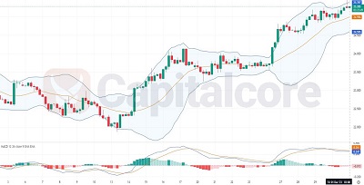
Silver, a precious metal traded widely for both its investment appeal and industrial use, reflects a complex interplay of supply and demand dynamics. In this technical analysis of the 4-hour chart, we will dissect the market’s recent behavior by examining the MACD and Bollinger Bands to understand the underlying trends and potential future movements.

Chart Notes:
• Chart time-zone is UTC (+03:00)
• Candles’ time-frame is 4h.
The 4-hour chart for Silver shows a market in fluctuation within the confines of its Bollinger Bands. Recently, price action has breached the upper Bollinger Band, suggesting a potential overextension of the price movement. Typically, such breaches can indicate a strong bullish sentiment, but they also warn of possible retracements as prices revert to the mean. The MACD indicator underlines this bullish momentum, with the MACD line (blue) positioned above the signal line (orange) and the histogram displaying increasing bullish bars. However, the MACD lines are not at extreme levels, which suggests that while the uptrend is in place, it might be approaching a zone where caution is warranted. Traders should watch for any crossover of the MACD line below the signal line as a potential early indication of a trend reversal or consolidation phase.
• DISCLAIMER: Please note that the above analysis is not an investment suggestion by “Capitalcore Ltd”. This post has been published only for educational purposes.